The ICC Cricket World Cup 2011 is ON and we all are geared up to celebrate India’s Victory!!! With almost every match coming to a nail bitting end its sure going to be a tough ride for India.
Lets look at the story behind the logo of such a big event – Cricket World Cup 2011.
The logo was designed by Witekite, a creative firm specialising in sport & major events worldwide, from Australia. The logo was unveiled in July 2009, at an official ceremony in Mumbai. As many as 12 companies from all over the world had submitted their concept, for the ICC World Cup 2011 logo.
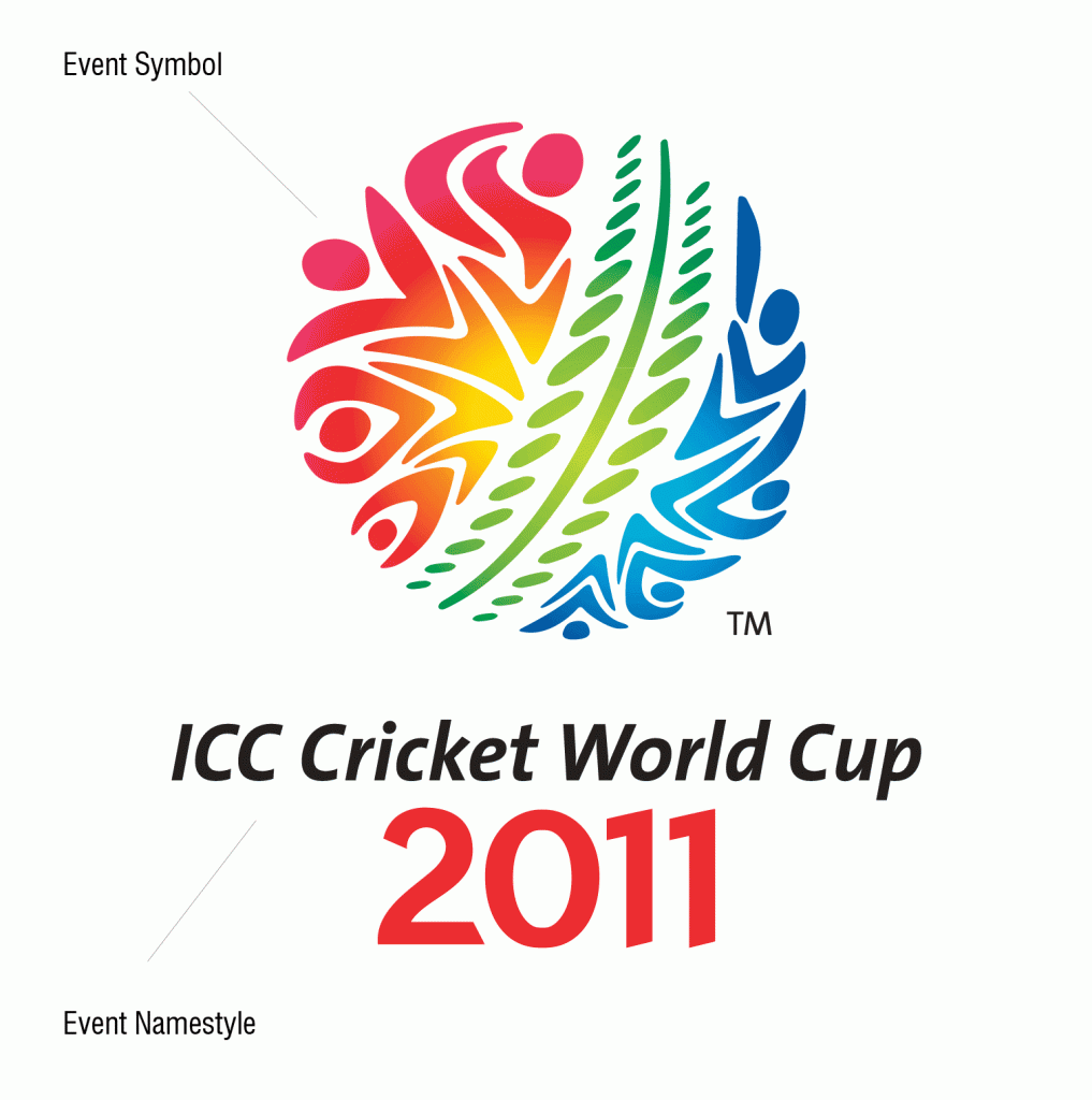
The logo is colorful and full of joy. The logo reflects the crowd as well as the players themselves. It is designed in a circular shape to reflect a cricket ball hurtling down the pitch with power and grace. In the center of the logo lies down the pitch which is surrounded by the crowd and the players. The color used for the logo represents the Event Hosting Nations namely India, Bangladesh and Sri Lanka. It’s Celebration of Cricket!
The logo comprises of two parts
1. The Event Symbol
2. The Event Namestyle


its simply superb
its Superb
[…] from Australia, which was commissioned by FutureBrand, an international agency. Even the logo for ICC Cricket World Cup 2011 was designed by a creative firm from […]